Categories
artnude fine art nude Hotelito travel

Part 20 of 50: Brooke and the Big Leaf

This is part twenty in a series of blogs on my artistic adventures in Todos Santos, Mexico late last year.

Sorry it’s been a while. Alright. Where were we?

Brooke Lynne sizes up her shooting partner for the day

I had been photographing the lovely models of ZoeFest X for almost a week and somehow I had managed to photograph all but three in a fairly short amount of time. Sometimes three shoots a day in the hot Todos Santos sun. No complaints from me, however. Every shoot was unique and special in its own way. Creatively very rewarding.

Now it was time for my collaboration with Brooke Lynne . I first spoke with Brooke about shooting at the getting-to-know-you party at Casa Dracula the night we all arrived. Brooke has a reserved quiet quality about her. She’s also got a wicked fun side and she’s a self admitted nerd of the best kind, but if you want to experience it, you have to put your time in and be patient. It’s worth the wait.

I can’t say exactly what caused me to hone in on her that very first night. I’m usually pretty good a sizing people up, especially the ones that aren’t the life of the party. I know there’s something special there. They’re not in the spotlight… yet. But I got a feeling that when it would be her turn in front of my camera, I would experience something unlike I had experienced with other model shoots in my career. I can’t explain why. I don’t understand it myself. I just seem to be good at knowing these things.

I’ve had a long standing rule about shoots. If it’s a commercial shoot, everyone has to show up and put on their game face. Whether they’re under the weather, relationship unpleasantness or other personal mishaps, we’re all professionals and everyone puts aside any issues and we get the job done.

Brooke Lynn with Banana Leaf at the Hotelito

However, when we’re creating art, taking something in our imaginations and turning it into a photograph, there is a certain level of being in the right creative space that is very necessary to make something extraordinary. Creativity is not something you turn on like a light switch. It takes a bit of nurturing. If either my model or I happen to be having a bad day, I can see it in the photos. They’re not bad, especially if I’m working with a model at the level of everyone at ZoeFest, but it’s harder to go from great to amazing if we’re not both in the zone.

Brooke and I had originally scheduled our shoot for a few days earlier, after I photographed Meghan at the dam. But when I returned to the Hotelito to drop Meghan off and get ready for Brooke, I found her in the living room, curled up in a chair, looking lovely as always, but I could see in her face she wasn’t feeling it.

So I called an audible. “Hey Brooke, how are you doing?”

“I’m okay,” she softly replied.

Brooke Lynn with Banana Leaf at the Hotelito

I thought for a moment.

“Tell you what,” I said, “Sometimes today isn’t the day, you know? And I know everyone is going to see the baby turtles tonight right around the time we were planning to shoot. Do you want to maybe postpone our shoot for another day and just enjoy the baby turtles?”

Immediately her face lit up. “Really?”

“Sure. I have some time open on Sunday if you want to move our shoot.”

She checked her schedule and she had time on Sunday as well. Done.

It turned out to be a great decision. We all got to enjoy the turtles and it gave me a little more time to prepare something Brooke had suggested a few days earlier.

As I’ve mentioned before, my room at Todos Santos Inn was in the middle of a lush garden. Palm trees stretching up toward the sky with huge slender leaves that provided such welcome shade on hot days. Brooke had asked me if we might try something with one of the giant banana leaves.

“Do you thing you can get one?”, she wondered.

I was pretty sure I could. I had become friendly with one of the gardeners at the inn and I went about asking him how I might get a big leaf without causing undo damage to the lovely garden. I didn’t think it would be right to cut off a perfectly good leaf on my own. Perhaps he could find me a leaf that was in need of trimming.

Brooke Lynn with Banana Leaf at the Hotelito

My Spanish was pretty basic and certainly lacking in gardening vocabulary, so I had to resort to broken Spanish and a lot of hand gesturing.

I raised both of my arms in front of me and made a kind of giant scissors pantomime and said, “Uno palm, por favor?” I didn’t know the word for leaf. I then made the universal taking a photo pantomime of holding both of my hands up to may face in a box shape and clicking the imaginary shutter.

“Oh, sí, sí, señor. Uno momento,” he replied and walked off toward the garden. He returned with a large menacing pair of gardening shears.

I laughed, “No, no, señior. The leaf. Uno leaf.” I grabbed the edge of one of the giant banana leaves, trying desperately to make up for my language inadequacy.

He smiled. “Ah, sí.” And he grabbed the leaf as well.

“Mañana?”, I asked, thinking it might take him a bit of time to find me a leaf that was out of sight or nearing the end of it’s life. I really didn’t want to deforest the lovely garden.

He nodded. “Mañana.”

“Gracias.”

Brooke Lynn with Banana Leaf at the Hotelito

Sure enough, when I woke up the next morning, right outside my door was a giant seven foot tall single banana leaf. Perfecto!

I barely managed to get the enormous thing in my rental car without bending it, but I did. It basically was my passenger for the short drive over to the Hotelito to see Brooke.

I knocked on the main door. “Brooke? I have a surprise for you!”

She opened the door and I walked in with the massive leaf.

“Oh! This is wonderful!”, she exclaimed. “Where did you get it?”

I explained my little story with the gardener and we agreed we were going to have fun with this.

“How about we find a bit of shade to shoot in. Brooke was completely on the same page. “Yes, shade would be excellent.”

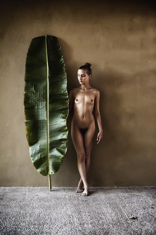
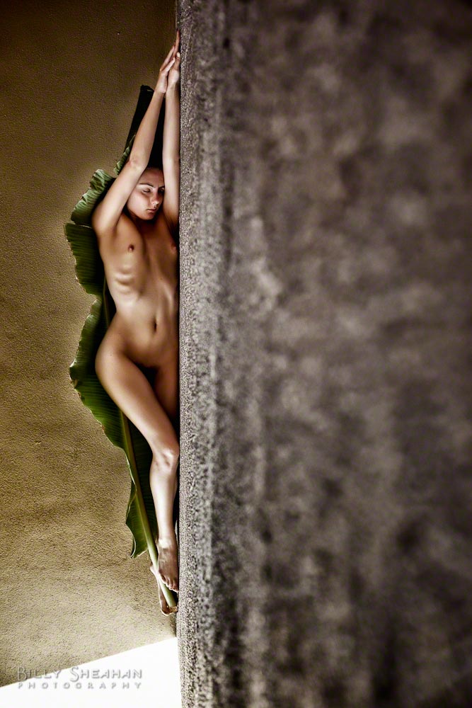
We found a wall in the outdoor courtyard that the sun hadn’t reached yet and decided it would be perfect. A simple little texture, but Brooke and her new leaf friend would be the focus. Nothing else would be needed. Simplicity in composition.

I should mention at this point that Brooke is a bit of a pretzel. In the best way. She really folds herself into whatever environment she happened to be working in. Boxes, ledges, railings. She becomes part of the scene like a gorgeous chameleon.

Brooke Lynn with Banana Leaf at the Hotelito

As I began to take my light readings and select a lens to begin with, Brooke investigated the leaf like it was a piece of haute couture. If there had been a three-way department store mirror, I could have imagined her holding it up in front of her like a designer dress. She rehearsed standing in front of it. Behind it. Wrapping herself up in it. She was playing and it was incredible to watch her figure it out.

We were both in the zone. Well worth the slight postponement from the other day.

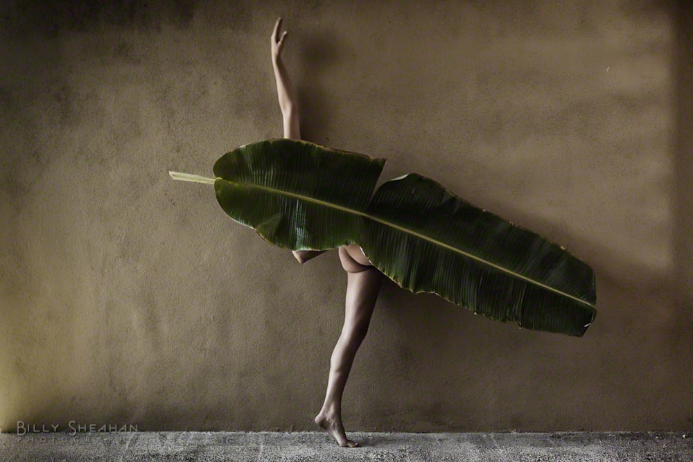
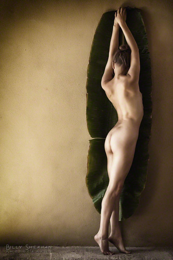
We began the shoot working vertically, with the banana leaf and Brooke both standing as she evoked a bit of a fan dance. Limbs springing forth from behind the leaf in surprising ways as I composed my photographs. We were off to a great start.

We took a moment to review of a few of the frames and both wildly happy with our beginnings, we decided to change it up a bit.

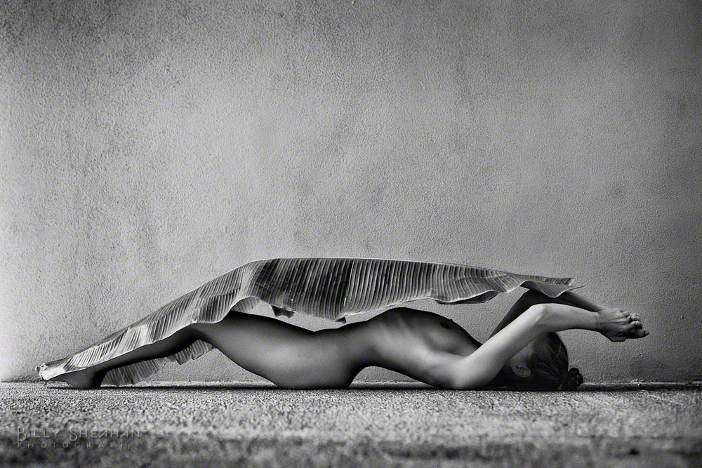
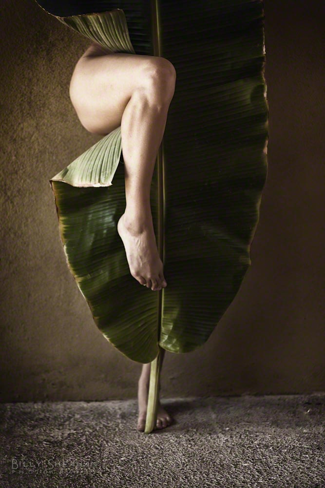
“Let’s try some with you on the ground with the leaf,” I suggested. I got on the ground with her, shooting along the cement patio floor at the same level as Brooke and watched her continue to experiment, this time horizontally. Even though she couldn’t see what I was seeing, it was amazing how she was able to contort her body to follow the lines of the leaf with very little direction from me. Occasionally I would tell her to arch or stretch to get her body and the leaf lined up, but only occasionally. She’s just that good.

Brooke Lynn with Banana Leaf at the Hotelito

Finally I moved a bit closer and made tighter compositions. And Brooke found more interesting ways to work with her new green friend. All the while balancing on one foot while holding the leaf in position. Not as easy as it looks, I can tell you.

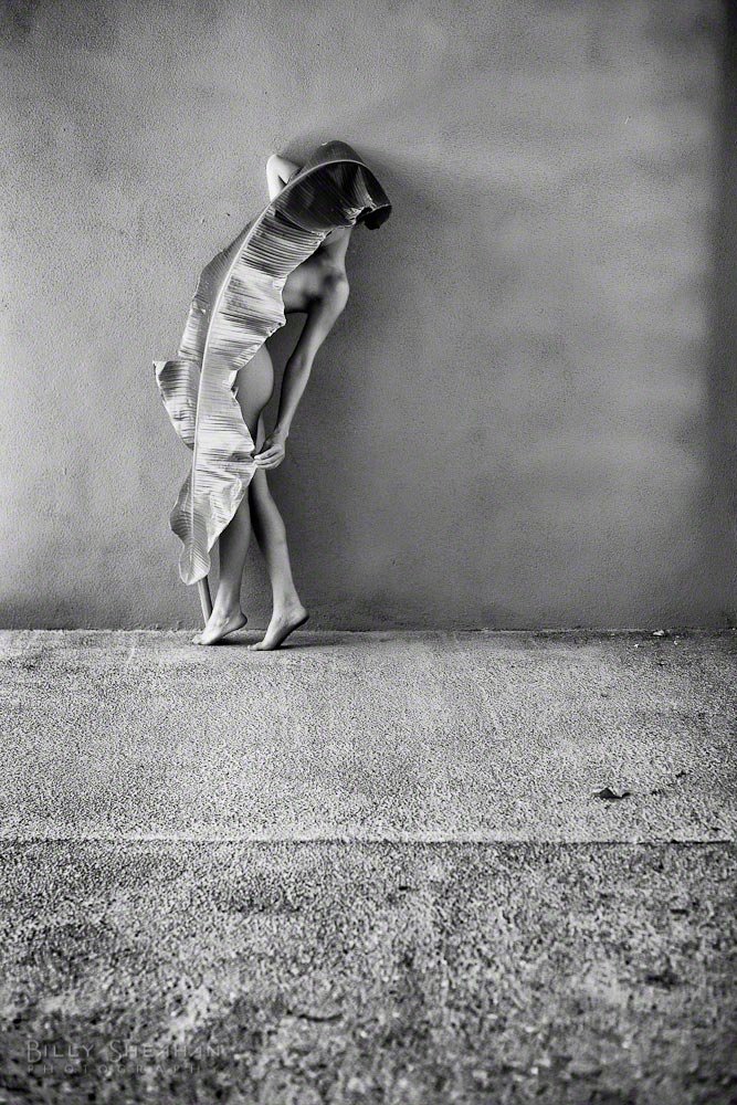
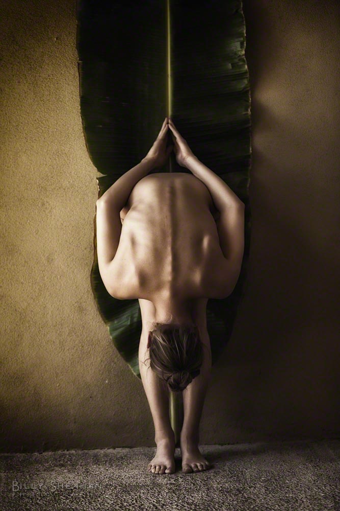
I hadn’t yet exactly given Brooke the opportunity to do her pretzel thing, which she’s so good at. But towards the end of the shoot we decided to have her work in front of the leaf and bend herself forward in her trademark style. She has such beautiful balance and symmetry when she does that. A real joy to see as a photographer.

After a few hours we both knew what we had accomplished what we had set out to do. It’s such a great feeling when you see an idea make its way from a fuzzy vague vision in your head to a photograph. We reviewed a few more images from our collaboration and then took some time to unwind in the beautiful Mexican sun.

We talked about art and life and travel. All of those wonderful things I love to discuss with anyone I’m working with. Brooke has such a soulful quality about her. Sometimes quiet, always observing. Really taking in her world at any given moment.

She told me she was preparing for a two month stay in Paris for a few months, working as an art model. I was at the same time both jealous and thrilled for her. She’d be perfect in Paris. Finding inspiration in a city full of inspiration.

Brooke Lynn with Banana Leaf at the Hotelito

Our post shoot conversation was a wonderful afterglow to an inspiring shoot. I always find my photographs of people who I have spent some time with always have a little extra special sauce in them. It’s not that I can’t simply appreciate the external beauty of my subjects, because I do, certainly with all of the ZoeFest models I had the pleasure of photographing. But I really believe that if I understand a model’s point of view, where she’s coming from, what she’s about, that always helps me capture a more meaningful representation of who she is.

I packed up my camera gear, wished Brooke a pleasant day and walked out of the Hotelito courtyard with the biggest smile on my face. My collaboration with Brooke and the Big Leaf was so well worth the brief wait. It certainly was better than showing up with a large pair of garden shears, although I’m sure she would have found something creative to do with those as well!

My next shoot was scheduled in a few hours with the lovely Anne Duffy and I was in the perfect creative space and looking forward to finding another round of inspiration with her. I drove off down the dusty road toward Casa Bentley.

Categories
artnude fine art nude travel

Part 16 of 50: Color or Black and White? A Photographers Dilemma

This is part sixteen in a series of blogs on my recent artistic adventures in Mexico.

I’ve been writing a lot about how I decide whether the photographs I create are going to end up being in black & white or color. Perhaps it’s time to share my opinions on that further after the last entry about collaborating at ZoeFest with the lovely Keira Grant and the images of her in both B&W and color.

Keria - Color and B&W
Keria – Color and B&W

It used to be that decision had to be made when choosing what film I was going to load into my film cameras. I used to travel with two camera bodies, one loaded with B&W film and the other with color. It allowed me the flexibility to instantly decide whether the subject matter I was standing in front of would be more pleasing to me if photographed with or without color.

If I happened to be traveling with only one camera body, it was more complicated. If I had color film in the camera and wanted to make a B&W photograph, I would note the frame number on the roll of film that I was currently shooting, carefully rewind the film until I heard it release from the take up reel, but not before the film edge wound back completely into the film canister. Then I would remove the color roll from the camera and load a fresh roll of B&W film.

When I wanted to switch back to color, I would do the same with the partially exposed B&W roll, carefully winding it back, removing it and then loading the previously exposed roll of color film back into the camera. Then, with the lens cap on, I would fire off the number of frames I had previously exposed, plus a couple more to make sure I was past any exposed images, and continue shooting on that film roll.

Yes, it was painful and time consuming. Sometimes the scene I wanted to photograph might be gone before the film swap could be completed. And sure, I could have just shot color all the time and put the color negatives in my darkroom enlarger and made B&W prints from those, and I did on a few occasions. But the results were never pleasing. There was something muddy about the B&W prints from color negative.

This was long before Photoshop and film scanners were readily available to me. Everything was chemical based and analog.

When I began to shoot with early digital cameras, I had to wrap my head around the idea that everything I would shoot would now be acquired in color, no matter whether I was planning to end up with a B&W image or not. In some ways it was freeing to not have to make that decision until I was sitting in front of my computer, but I found myself a bit confused when composing my images in a digital camera format.

Let me explain. As I began learning about composition with my first film cameras, being self taught, I wasn’t even aware of the concept of composition. I just knew if a photograph felt right to me. In my head, I thought of it as balancing the various objects in the frame, so the resulting image didn’t feel too heavy on one side or the other or top or bottom. Almost like the elements in the frame had physical weight to them and once in a frame on the wall, the picture frame would tend to rotate clockwise on the wall if there where too many “heavy” objects on the right side of the photograph.

It sounds a little crazy, but that’s how I looked at composition back in those early days. If there was something “heavy” in the image, it would have to be balanced by what I would later learn was negative space in the rest of the photograph. An area of elements that felt lighter in weight (not necessarily lighter or darker in luminance). A heavy element could be something dark in tone or large or something your eye naturally gravitated to when viewing. A heavy object had, what I liked to call, visual gravity.

So what does all of this have to do with the question of B&W or color?

Everything, it turns out.

B&W is shades of gray and color is… well.. color. When I look at a B&W image, it’s all about shapes and how they balance with each other from a brightness point of view. With color, in addition to the shapes, you have the visual volume of color. Some colors are just louder than others. They are heavier. They have more visual gravity.

Carlotta Champagne, color and B&W comparison

I don’t usually let thousands of people into my digital darkroom at once, but let’s take a look at what I see when I’m deciding B&W or color.

The image on the left is the color version with a little post processing for color temperature, contrast and vibrance. It’s a perfectly fine image. But when I was shooting it, I knew I was going to process it in B&W and so I left a lot of negative space at the bottom, the blue water, that I knew I would filter towards black in post.

In color however, it’s not really negative space. It’s a very loud color. So loud in fact that as lovely as Carlotta is, her loveliness is fighting with the blue for your eye’s attention.

In the B&W version, the blue water becomes dark negative space and now Carlotta really pops! Your eye goes right to her and perhaps the palm leaves to her right which have been filtered to be brighter. It’s all getting your eyes to the top half of the photo, where I want them to be.

Of course, Carlotta has her own sense of visual gravity, so she really didn’t need much help from me!

Additionally, in the B&W version, her skin becomes very bright and in order to make a visually interesting composition, I like to add something in the frame that balances it out. The dark tone of the water does that perfectly. And the palm leaves give me a medium weight. Your eye goes to them, but only after you find Carlotta.

Ella - B&W and Color
Ella – B&W and Color

However, with all of that heavy or light, negative space, color loudness and other creative data swirling around in my head sometimes I really can’t decide whether I’m making a color or B&W image when I click the shutter. That was certainly the case while photographing Ella Rose.

That, and I was very focused on keeping my camera from getting hit by a sneaky wave and ever so slightly less on the composition at hand.

Which is better? The color or the B&W process? To me, they’re both beautiful images (thank you Ella!). But again, the B&W is more about Ella and less about her environment, as incredible as it is. The color image is a little bit flatter to me. But that’s my subjective opinion. Some viewers will prefer the color and some will prefer the B&W. Which is fine. Ella is lovely with or without chrominance.

Most of the time with subject matter such as art nudes, I’m 90% sure I’m going to end up with a B&W image.

We can program our digital cameras to shoot in a sort of B&W mode, but it’s still acquiring the image in RGB color. But if you really care about your B&W conversions, you won’t have your camera doing them on the fly with it’s limited processing ability. Much better to do them in post later where you can control how the various colors in the image are converted to B&W.

If you’re shooting RAW images, it’s a moot point anyway. Even with your camera set to display the thumbnail image in your camera’s display in B&W (which I sometimes do to keep my head in B&W space when chimping* during a shoot), it’s still recording the data in color. It’s only when you shoot JPGs that the B&W version is what is permanently recorded to the camera file.

In my early forays into digital, my B&W conversions were pretty bland. I did what most digital newbies did and simply turned off the color information in Photoshop if I wanted a B&W image. Blech.

Just like learning my chemical darkroom, it took me years to learn to manipulate the individual RGB channels of color. Like putting a colored red or yellow lens filter on a camera when shooting B&W or using contrast filters in the chemical darkroom, I learned through trial and error that, just like in the film days, composing and properly exposing an image in camera was only half of the process. Dodging and burning while making prints, using different kinds of chemical developer and even the different types of film stock I was using in the camera as well as the photographic paper I was using in the darkroom all contributed to the final look of my images.

Now, I’m not going to get all, “Back in my day, you spent hours in the darkroom breathing toxic chemicals and your fingers always smelled like fixer,” on you here. There is a lot about the darkroom I don’t miss, but it did teach me a lot about processing my images, which after years of practice on my computer, I was able to duplicate in a way that reminded me of my film prints. And I do mean years of practice. I sucked at it for a long time. And I’m still learning.

And there’s another reason I usually prefer my fine art nude images to be in B&W. The human form is a wondrous shape. B&W tends to be more about the very basic shape and form of a subject. It does feel more artistic because it’s not really based in reality. Very few people see the world in B&W (I mean that literally, not figuratively!). Without color, the image does take on a more removed from the starkness of reality feel to it. To me, it’s removing everything but light and shape. And I really like to compose in that space. It’s a bit more timeless to me that way.

Additionally, removing the color skin tone from of a nude art image, and this is just my personal opinion, separates it from the millions of other more commercial color nude/semi nude images in the world, many less artistic than what we’re talking about here. Now, certainly there are some very ridiculously talented artists out there that do nude color work. Some of the photographers I was lucky enough to spend time with at ZoeFest, do amazing things with color nudes. And of course Michelangelo didn’t paint the Sistine Chapel in monochrome. Plenty of nude skin tones there, ironically.

But we see so much skin in the world these days. Clearly, I’m personally not against that in principle in viewing the photographic work that I create. Since the beginning of human artistic expression, I’m only #4,638,301 in a long line of artists who have decided that the human form is something especially inspiring and compelling. I’m not the first one to look at a body, devoid of any covering and be in awe. For me, women’s bodies are especially artistic.

Keira Grant, color and B&W comparison

Here’s another comparison of a color and B&W processed photograph of Keira. She is stunning in both instances, but I definitely prefer the B&W image in this case. It’s more subtle. In the color version the skin color is very prominent. There’s nothing wrong with that and it is still a very artistic image. Lovely and compelling.

The B&W version however, is definitely more about the shapes and movement. It takes the viewer a split second longer to figure out what the subject is without the skin tone instantly giving it away.

Now, that’s certainly an extreme example, but it illustrates what I feel when I’m deciding to go with color or B&W.

Even in my travel photography, I find that B&W does tend to take the sense of time out of the image. Was it taken last year or 60 years ago?

I also think B&W has a better chance of engaging the viewer’s mind. The viewer already has to consider the image without color, filling in the information that is missing and maybe that also puts them in the headspace of imagination a little more than a color image. Maybe they create a story about the subject matter in their head. A story that is unique to them and their own experience.

Oh hell, maybe they just think she’s pretty. I don’t know.

Much more to come!

*Chimping: After taking a photograph with a digital camera, the process of looking at that image in your camera’s digital display. Chimping after every single photograph is regarded negatively by some photographers, especially those who learned to shoot on film cameras and didn’t have the luxury of instantly seeing what an image was going to look like unless they were shooting a test polaroid. They had to know their craft well enough to know if the photograph was properly exposed and what it was going to look like before it came back from the lab.

Chimping can also disrupt the flow of a photo shoot as it can take both photographer and subject out of the creative moment during frequent stops to play back images. I have to remind myself of that on occasion. Make a test exposure and check it once. That’s your polaroid. Then focus exclusively on your subject.