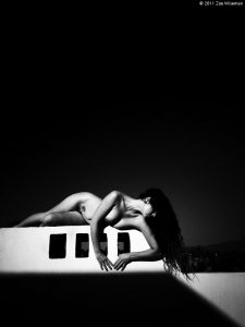
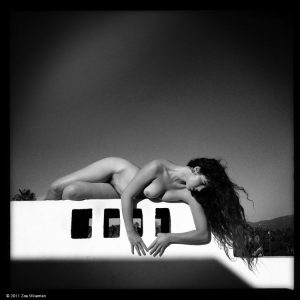
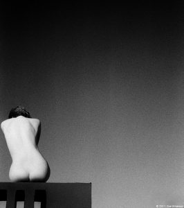
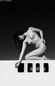
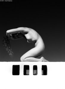
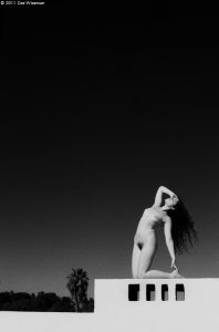
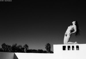
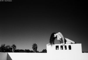
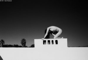
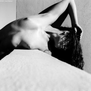
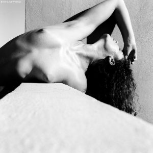
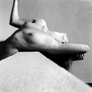
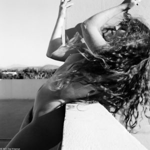
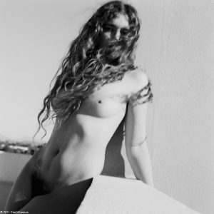
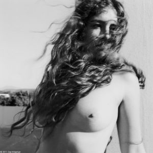
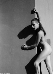
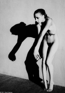
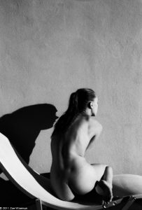
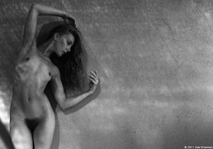
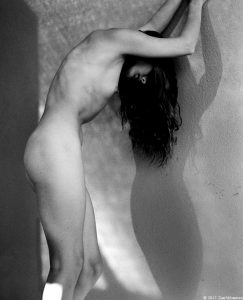
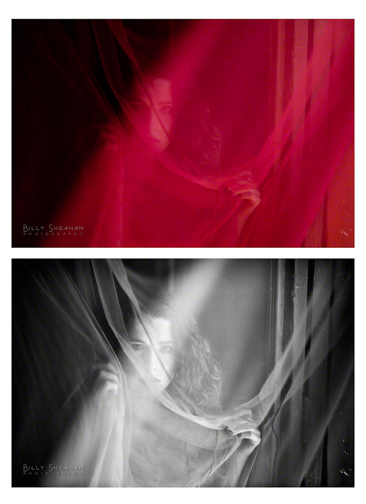
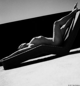
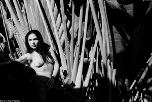
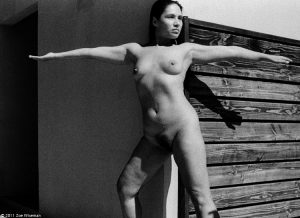
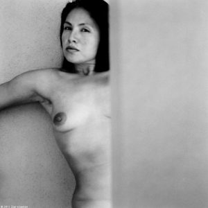
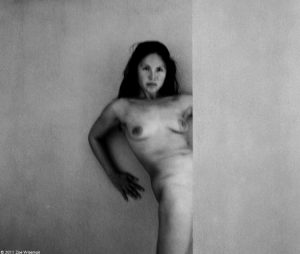
Rebecca and I had worked together back at the ’08 gathering in 29 Palms and we made some very awesome and unique images. Both of us being from far away places, it was great to have the opportunity once again to work together again.
What I didn’t realize since our first encounter was the rise in her own photography and vision, and was amazed with her approach and execution of her art. Her 2010 slide show was the previous year’s winner which I was able to see on this site which Zoe posted. 🙂 Seeing her 2011 show was fantastic and I only see bigger and brighter things in her future.
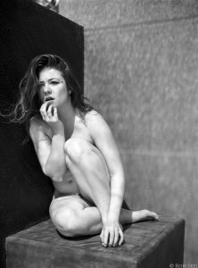
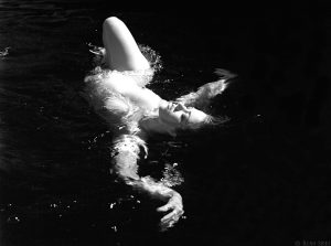
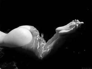
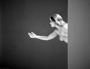
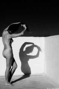
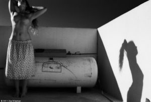
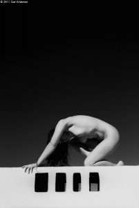
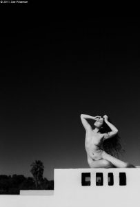
As for the title of this post, ‘A Collaboration’, this is inspired by what we accomplished. Staying at the Hotelito, I saw a setting which I wanted to capture with the privacy walls around my room which we took advantage of. Rebecca had wanted to take advantage of posing in the pool with some motion captures and brought this to my attention which I was more than happy to take advantage of.
That said, what she envisioned and how I visualized it could be two entirely different perspectives. As well, motion imaging can be hit and miss and at the time I wasn’t certain I would captured the composition with the motions. Her motions/poses I was not worried of, it was my timing. Alas, I was pleasantly surprised and moreso very happy with the captures.
Yay collaborations!! 🙂
I’m done rambling’… here are a few from that session…
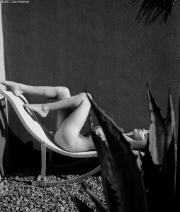
You always hope to pick up shoots with those you weren’t able to pre-book throughout the week. On Halloween I thought I would just sit around. Then sitting around got boring. Meghan was just sitting around too. So we did this for an hour. 🙂
My tenth shoot! In year 10! In the 10th month of the year! On the 30th day of the month! 3’s. 333. I made a wish for good photos. Brooke Lynne is awesome so wishing was kind of silly. Enjoy.
Looking forward to seeing all the rest of everyone’s images! I have two more shoots to post then my fun posting is over. Kind of sad about that. I need a commune somewhere so this can continue all year round. ho hum.
The memories are still quite fresh of the time spent in Todos Santos with wonderful friends, some long time and some new. A most magical place which will need to be revisited in the future as I saw only a fraction of what magic it has.
All rolls have been developed and images scanned. Roughly about halfway through the editing and though some of it was ready for presentation a couple of weeks ago, decided to start the posting of work from Mexico in the new year, which is of course, today 🙂 ***due note, Australians had to suffer the wait until the 2nd, ;)***
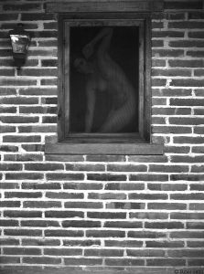
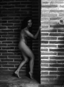
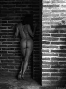
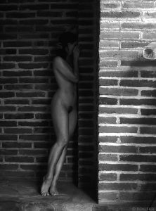
Normally I do my edits in order of who I photographed first but this time around I decided to draw names out of a hat and the first was Candace. We have worked together numerous times since 2005, both at the Zoefest gatherings and visits to British Columbia. Outstanding model as we all know and never a dull moment.
We shot later in the week and utilized the exteriors of her room. The brick had a lot of character with nice lines and textures. The stucco made for a nice blank canvas for Candace and who is now known as Paco to do their magic.
This is part sixteen in a series of blogs on my recent artistic adventures in Mexico.
I’ve been writing a lot about how I decide whether the photographs I create are going to end up being in black & white or color. Perhaps it’s time to share my opinions on that further after the last entry about collaborating at ZoeFest with the lovely Keira Grant and the images of her in both B&W and color.
Keria – Color and B&W
It used to be that decision had to be made when choosing what film I was going to load into my film cameras. I used to travel with two camera bodies, one loaded with B&W film and the other with color. It allowed me the flexibility to instantly decide whether the subject matter I was standing in front of would be more pleasing to me if photographed with or without color.
If I happened to be traveling with only one camera body, it was more complicated. If I had color film in the camera and wanted to make a B&W photograph, I would note the frame number on the roll of film that I was currently shooting, carefully rewind the film until I heard it release from the take up reel, but not before the film edge wound back completely into the film canister. Then I would remove the color roll from the camera and load a fresh roll of B&W film.
When I wanted to switch back to color, I would do the same with the partially exposed B&W roll, carefully winding it back, removing it and then loading the previously exposed roll of color film back into the camera. Then, with the lens cap on, I would fire off the number of frames I had previously exposed, plus a couple more to make sure I was past any exposed images, and continue shooting on that film roll.
Yes, it was painful and time consuming. Sometimes the scene I wanted to photograph might be gone before the film swap could be completed. And sure, I could have just shot color all the time and put the color negatives in my darkroom enlarger and made B&W prints from those, and I did on a few occasions. But the results were never pleasing. There was something muddy about the B&W prints from color negative.
This was long before Photoshop and film scanners were readily available to me. Everything was chemical based and analog.
When I began to shoot with early digital cameras, I had to wrap my head around the idea that everything I would shoot would now be acquired in color, no matter whether I was planning to end up with a B&W image or not. In some ways it was freeing to not have to make that decision until I was sitting in front of my computer, but I found myself a bit confused when composing my images in a digital camera format.
Let me explain. As I began learning about composition with my first film cameras, being self taught, I wasn’t even aware of the concept of composition. I just knew if a photograph felt right to me. In my head, I thought of it as balancing the various objects in the frame, so the resulting image didn’t feel too heavy on one side or the other or top or bottom. Almost like the elements in the frame had physical weight to them and once in a frame on the wall, the picture frame would tend to rotate clockwise on the wall if there where too many “heavy” objects on the right side of the photograph.
It sounds a little crazy, but that’s how I looked at composition back in those early days. If there was something “heavy” in the image, it would have to be balanced by what I would later learn was negative space in the rest of the photograph. An area of elements that felt lighter in weight (not necessarily lighter or darker in luminance). A heavy element could be something dark in tone or large or something your eye naturally gravitated to when viewing. A heavy object had, what I liked to call, visual gravity.
So what does all of this have to do with the question of B&W or color?
Everything, it turns out.
B&W is shades of gray and color is… well.. color. When I look at a B&W image, it’s all about shapes and how they balance with each other from a brightness point of view. With color, in addition to the shapes, you have the visual volume of color. Some colors are just louder than others. They are heavier. They have more visual gravity.
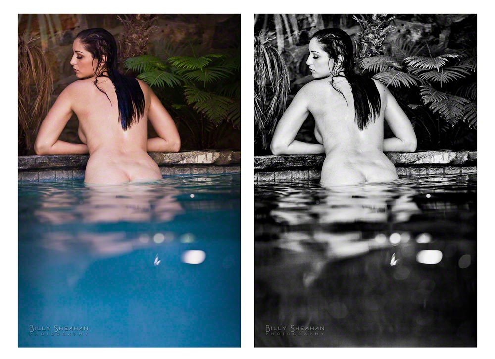
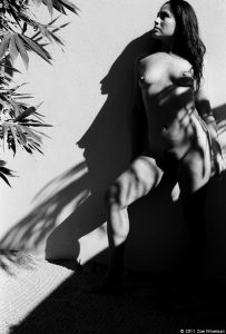
Carlotta Champagne, color and B&W comparison
I don’t usually let thousands of people into my digital darkroom at once, but let’s take a look at what I see when I’m deciding B&W or color.
The image on the left is the color version with a little post processing for color temperature, contrast and vibrance. It’s a perfectly fine image. But when I was shooting it, I knew I was going to process it in B&W and so I left a lot of negative space at the bottom, the blue water, that I knew I would filter towards black in post.
In color however, it’s not really negative space. It’s a very loud color. So loud in fact that as lovely as Carlotta is, her loveliness is fighting with the blue for your eye’s attention.
In the B&W version, the blue water becomes dark negative space and now Carlotta really pops! Your eye goes right to her and perhaps the palm leaves to her right which have been filtered to be brighter. It’s all getting your eyes to the top half of the photo, where I want them to be.
Of course, Carlotta has her own sense of visual gravity, so she really didn’t need much help from me!
Additionally, in the B&W version, her skin becomes very bright and in order to make a visually interesting composition, I like to add something in the frame that balances it out. The dark tone of the water does that perfectly. And the palm leaves give me a medium weight. Your eye goes to them, but only after you find Carlotta.
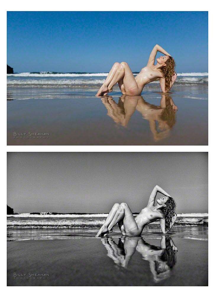
Ella – B&W and Color
However, with all of that heavy or light, negative space, color loudness and other creative data swirling around in my head sometimes I really can’t decide whether I’m making a color or B&W image when I click the shutter. That was certainly the case while photographing Ella Rose.
That, and I was very focused on keeping my camera from getting hit by a sneaky wave and ever so slightly less on the composition at hand.
Which is better? The color or the B&W process? To me, they’re both beautiful images (thank you Ella!). But again, the B&W is more about Ella and less about her environment, as incredible as it is. The color image is a little bit flatter to me. But that’s my subjective opinion. Some viewers will prefer the color and some will prefer the B&W. Which is fine. Ella is lovely with or without chrominance.
Most of the time with subject matter such as art nudes, I’m 90% sure I’m going to end up with a B&W image.
We can program our digital cameras to shoot in a sort of B&W mode, but it’s still acquiring the image in RGB color. But if you really care about your B&W conversions, you won’t have your camera doing them on the fly with it’s limited processing ability. Much better to do them in post later where you can control how the various colors in the image are converted to B&W.
If you’re shooting RAW images, it’s a moot point anyway. Even with your camera set to display the thumbnail image in your camera’s display in B&W (which I sometimes do to keep my head in B&W space when chimping* during a shoot), it’s still recording the data in color. It’s only when you shoot JPGs that the B&W version is what is permanently recorded to the camera file.
In my early forays into digital, my B&W conversions were pretty bland. I did what most digital newbies did and simply turned off the color information in Photoshop if I wanted a B&W image. Blech.
Just like learning my chemical darkroom, it took me years to learn to manipulate the individual RGB channels of color. Like putting a colored red or yellow lens filter on a camera when shooting B&W or using contrast filters in the chemical darkroom, I learned through trial and error that, just like in the film days, composing and properly exposing an image in camera was only half of the process. Dodging and burning while making prints, using different kinds of chemical developer and even the different types of film stock I was using in the camera as well as the photographic paper I was using in the darkroom all contributed to the final look of my images.
Now, I’m not going to get all, “Back in my day, you spent hours in the darkroom breathing toxic chemicals and your fingers always smelled like fixer,” on you here. There is a lot about the darkroom I don’t miss, but it did teach me a lot about processing my images, which after years of practice on my computer, I was able to duplicate in a way that reminded me of my film prints. And I do mean years of practice. I sucked at it for a long time. And I’m still learning.
And there’s another reason I usually prefer my fine art nude images to be in B&W. The human form is a wondrous shape. B&W tends to be more about the very basic shape and form of a subject. It does feel more artistic because it’s not really based in reality. Very few people see the world in B&W (I mean that literally, not figuratively!). Without color, the image does take on a more removed from the starkness of reality feel to it. To me, it’s removing everything but light and shape. And I really like to compose in that space. It’s a bit more timeless to me that way.
Additionally, removing the color skin tone from of a nude art image, and this is just my personal opinion, separates it from the millions of other more commercial color nude/semi nude images in the world, many less artistic than what we’re talking about here. Now, certainly there are some very ridiculously talented artists out there that do nude color work. Some of the photographers I was lucky enough to spend time with at ZoeFest, do amazing things with color nudes. And of course Michelangelo didn’t paint the Sistine Chapel in monochrome. Plenty of nude skin tones there, ironically.
But we see so much skin in the world these days. Clearly, I’m personally not against that in principle in viewing the photographic work that I create. Since the beginning of human artistic expression, I’m only #4,638,301 in a long line of artists who have decided that the human form is something especially inspiring and compelling. I’m not the first one to look at a body, devoid of any covering and be in awe. For me, women’s bodies are especially artistic.
Keira Grant, color and B&W comparison
Here’s another comparison of a color and B&W processed photograph of Keira. She is stunning in both instances, but I definitely prefer the B&W image in this case. It’s more subtle. In the color version the skin color is very prominent. There’s nothing wrong with that and it is still a very artistic image. Lovely and compelling.
The B&W version however, is definitely more about the shapes and movement. It takes the viewer a split second longer to figure out what the subject is without the skin tone instantly giving it away.
Now, that’s certainly an extreme example, but it illustrates what I feel when I’m deciding to go with color or B&W.
Even in my travel photography, I find that B&W does tend to take the sense of time out of the image. Was it taken last year or 60 years ago?
I also think B&W has a better chance of engaging the viewer’s mind. The viewer already has to consider the image without color, filling in the information that is missing and maybe that also puts them in the headspace of imagination a little more than a color image. Maybe they create a story about the subject matter in their head. A story that is unique to them and their own experience.
Oh hell, maybe they just think she’s pretty. I don’t know.
Much more to come!
*Chimping:After taking a photograph with a digital camera, the process of looking at that image in your camera’s digital display. Chimping after every single photograph is regarded negatively by some photographers, especially those who learned to shoot on film cameras and didn’t have the luxury of instantly seeing what an image was going to look like unless they were shooting a test polaroid. They had to know their craft well enough to know if the photograph was properly exposed and what it was going to look like before it came back from the lab.
Chimping can also disrupt the flow of a photo shoot as it can take both photographer and subject out of the creative moment during frequent stops to play back images. I have to remind myself of that on occasion. Make a test exposure and check it once. That’s your polaroid. Then focus exclusively on your subject.
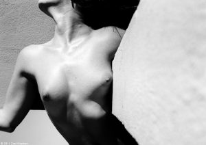
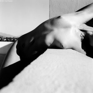
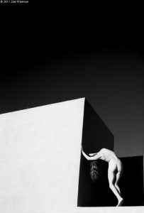
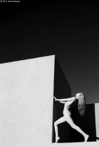
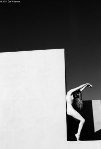
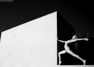
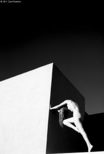
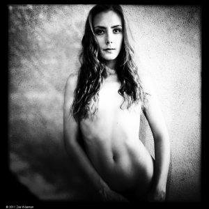
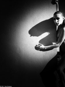
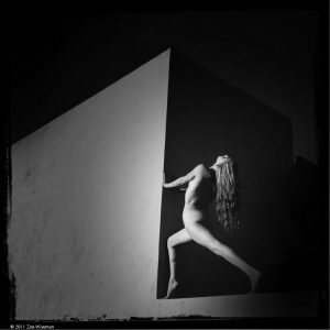
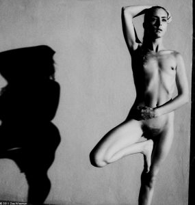
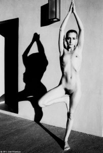
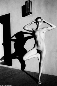
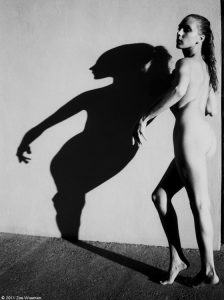
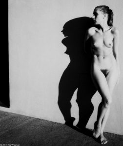
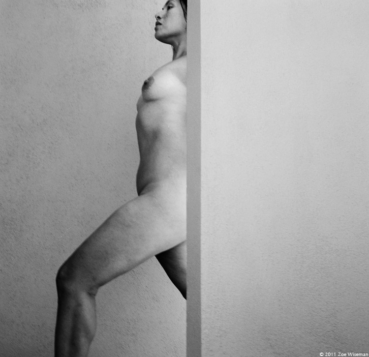
I loved the Hotelito for all it’s stark shooting situations and shady spots too. Who needs a backdrop when there’s an abundance of natural light and beautiful vivid walls? I knew it would be good shooting when I looked at it online before arriving and definitely was happy when I arrived. I’m enamored by modern architecture and bold lines.
I worked all week with my Nikon FM 35mm and my Rollei. Little cameras that didn’t weigh very much so I wasn’t carrying around tons of gear in the heat. Plus I was scared to pack up my 4×5 with all my Polaroid film for fear Mexican Customs would hassle me on arrival. On the way home at the airport when they were searching my bags before departing they didn’t know what 120 film was, so I may have had a hard time explaining Type 55 Pos/Neg film to them and Sodium Sulfite. Though Steven Billups managed to bring in all his Polaroid film. Though I was happy with all the work accomplished with my little cameras. I ended up shooting more and going back to the camera set up I learned on.
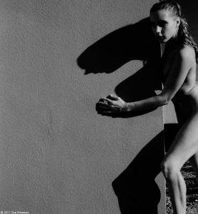
Claudine and I worked together back in 2008 during the 29 Palms festival with my 4×5, so good that I had something different with me to get a different look. We had the opportunity to work together twice this time around. This is our first shoot. We didn’t wander too far away from that fabulous swimming pool. Shoot 10 minutes, jump in, shoot 20 minutes, jump in again… that was my week really. Claudine is quite an enigma, in a good way. She seems so unassuming in person but when you point a camera in her direction this intense confidence pops out and lends itself to inspiration. She’s great to work with!