Soak up the light at Todos Santos Inn – shot with my home made bendy lens.

Soak up the light at Todos Santos Inn – shot with my home made bendy lens.
This is part sixteen in a series of blogs on my recent artistic adventures in Mexico.
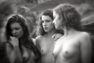
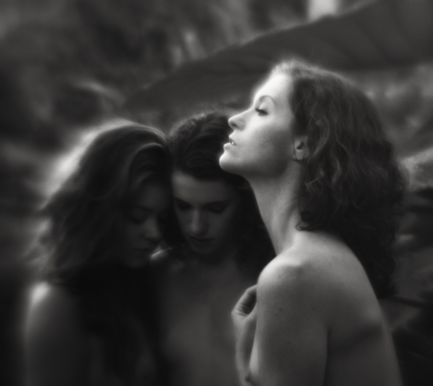
I’ve been writing a lot about how I decide whether the photographs I create are going to end up being in black & white or color. Perhaps it’s time to share my opinions on that further after the last entry about collaborating at ZoeFest with the lovely Keira Grant and the images of her in both B&W and color.
It used to be that decision had to be made when choosing what film I was going to load into my film cameras. I used to travel with two camera bodies, one loaded with B&W film and the other with color. It allowed me the flexibility to instantly decide whether the subject matter I was standing in front of would be more pleasing to me if photographed with or without color.
If I happened to be traveling with only one camera body, it was more complicated. If I had color film in the camera and wanted to make a B&W photograph, I would note the frame number on the roll of film that I was currently shooting, carefully rewind the film until I heard it release from the take up reel, but not before the film edge wound back completely into the film canister. Then I would remove the color roll from the camera and load a fresh roll of B&W film.
When I wanted to switch back to color, I would do the same with the partially exposed B&W roll, carefully winding it back, removing it and then loading the previously exposed roll of color film back into the camera. Then, with the lens cap on, I would fire off the number of frames I had previously exposed, plus a couple more to make sure I was past any exposed images, and continue shooting on that film roll.
Yes, it was painful and time consuming. Sometimes the scene I wanted to photograph might be gone before the film swap could be completed. And sure, I could have just shot color all the time and put the color negatives in my darkroom enlarger and made B&W prints from those, and I did on a few occasions. But the results were never pleasing. There was something muddy about the B&W prints from color negative.
This was long before Photoshop and film scanners were readily available to me. Everything was chemical based and analog.
When I began to shoot with early digital cameras, I had to wrap my head around the idea that everything I would shoot would now be acquired in color, no matter whether I was planning to end up with a B&W image or not. In some ways it was freeing to not have to make that decision until I was sitting in front of my computer, but I found myself a bit confused when composing my images in a digital camera format.
Let me explain. As I began learning about composition with my first film cameras, being self taught, I wasn’t even aware of the concept of composition. I just knew if a photograph felt right to me. In my head, I thought of it as balancing the various objects in the frame, so the resulting image didn’t feel too heavy on one side or the other or top or bottom. Almost like the elements in the frame had physical weight to them and once in a frame on the wall, the picture frame would tend to rotate clockwise on the wall if there where too many “heavy” objects on the right side of the photograph.
It sounds a little crazy, but that’s how I looked at composition back in those early days. If there was something “heavy” in the image, it would have to be balanced by what I would later learn was negative space in the rest of the photograph. An area of elements that felt lighter in weight (not necessarily lighter or darker in luminance). A heavy element could be something dark in tone or large or something your eye naturally gravitated to when viewing. A heavy object had, what I liked to call, visual gravity.
So what does all of this have to do with the question of B&W or color?
Everything, it turns out.
B&W is shades of gray and color is… well.. color. When I look at a B&W image, it’s all about shapes and how they balance with each other from a brightness point of view. With color, in addition to the shapes, you have the visual volume of color. Some colors are just louder than others. They are heavier. They have more visual gravity.
I don’t usually let thousands of people into my digital darkroom at once, but let’s take a look at what I see when I’m deciding B&W or color.
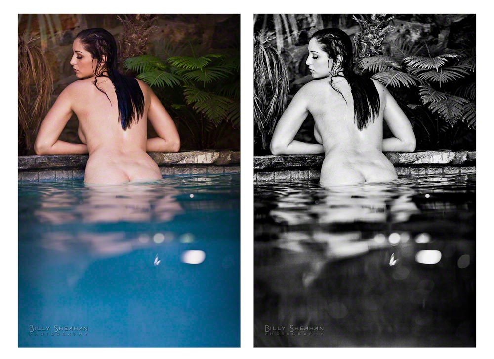
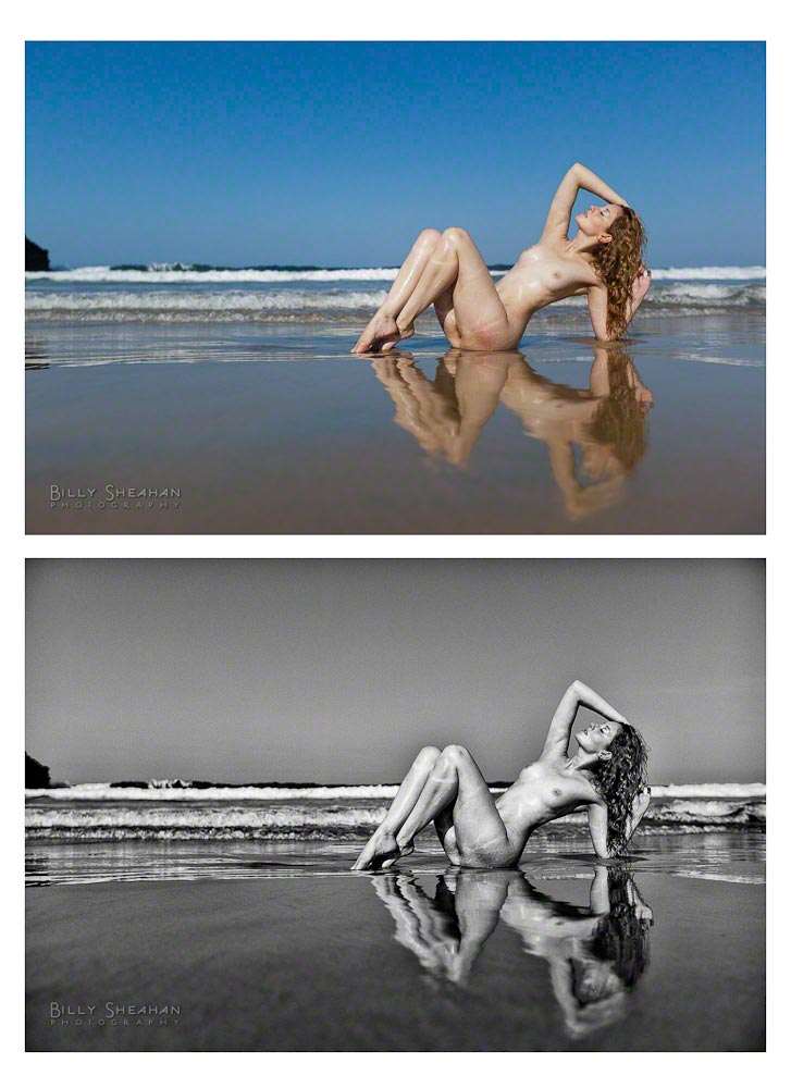
The image on the left is the color version with a little post processing for color temperature, contrast and vibrance. It’s a perfectly fine image. But when I was shooting it, I knew I was going to process it in B&W and so I left a lot of negative space at the bottom, the blue water, that I knew I would filter towards black in post.
In color however, it’s not really negative space. It’s a very loud color. So loud in fact that as lovely as Carlotta is, her loveliness is fighting with the blue for your eye’s attention.
In the B&W version, the blue water becomes dark negative space and now Carlotta really pops! Your eye goes right to her and perhaps the palm leaves to her right which have been filtered to be brighter. It’s all getting your eyes to the top half of the photo, where I want them to be.
Of course, Carlotta has her own sense of visual gravity, so she really didn’t need much help from me!
Additionally, in the B&W version, her skin becomes very bright and in order to make a visually interesting composition, I like to add something in the frame that balances it out. The dark tone of the water does that perfectly. And the palm leaves give me a medium weight. Your eye goes to them, but only after you find Carlotta.
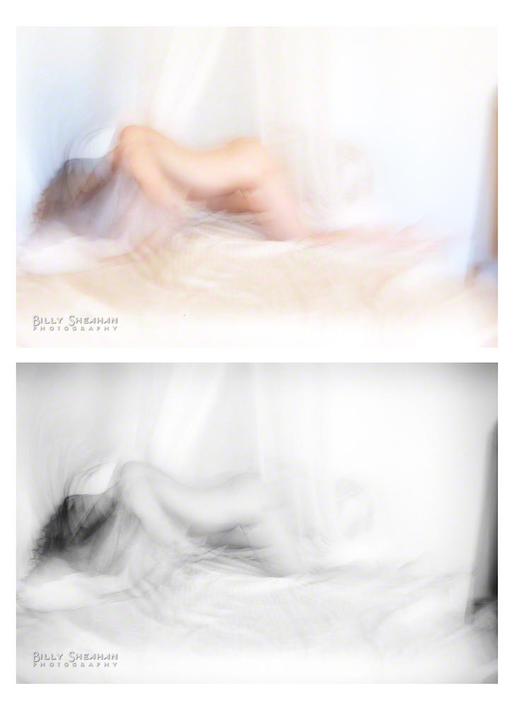
However, with all of that heavy or light, negative space, color loudness and other creative data swirling around in my head sometimes I really can’t decide whether I’m making a color or B&W image when I click the shutter. That was certainly the case while photographing Ella Rose.
That, and I was very focused on keeping my camera from getting hit by a sneaky wave and ever so slightly less on the composition at hand.
Which is better? The color or the B&W process? To me, they’re both beautiful images (thank you Ella!). But again, the B&W is more about Ella and less about her environment, as incredible as it is. The color image is a little bit flatter to me. But that’s my subjective opinion. Some viewers will prefer the color and some will prefer the B&W. Which is fine. Ella is lovely with or without chrominance.
Most of the time with subject matter such as art nudes, I’m 90% sure I’m going to end up with a B&W image.
We can program our digital cameras to shoot in a sort of B&W mode, but it’s still acquiring the image in RGB color. But if you really care about your B&W conversions, you won’t have your camera doing them on the fly with it’s limited processing ability. Much better to do them in post later where you can control how the various colors in the image are converted to B&W.
If you’re shooting RAW images, it’s a moot point anyway. Even with your camera set to display the thumbnail image in your camera’s display in B&W (which I sometimes do to keep my head in B&W space when chimping* during a shoot), it’s still recording the data in color. It’s only when you shoot JPGs that the B&W version is what is permanently recorded to the camera file.
In my early forays into digital, my B&W conversions were pretty bland. I did what most digital newbies did and simply turned off the color information in Photoshop if I wanted a B&W image. Blech.
Just like learning my chemical darkroom, it took me years to learn to manipulate the individual RGB channels of color. Like putting a colored red or yellow lens filter on a camera when shooting B&W or using contrast filters in the chemical darkroom, I learned through trial and error that, just like in the film days, composing and properly exposing an image in camera was only half of the process. Dodging and burning while making prints, using different kinds of chemical developer and even the different types of film stock I was using in the camera as well as the photographic paper I was using in the darkroom all contributed to the final look of my images.
Now, I’m not going to get all, “Back in my day, you spent hours in the darkroom breathing toxic chemicals and your fingers always smelled like fixer,” on you here. There is a lot about the darkroom I don’t miss, but it did teach me a lot about processing my images, which after years of practice on my computer, I was able to duplicate in a way that reminded me of my film prints. And I do mean years of practice. I sucked at it for a long time. And I’m still learning.
And there’s another reason I usually prefer my fine art nude images to be in B&W. The human form is a wondrous shape. B&W tends to be more about the very basic shape and form of a subject. It does feel more artistic because it’s not really based in reality. Very few people see the world in B&W (I mean that literally, not figuratively!). Without color, the image does take on a more removed from the starkness of reality feel to it. To me, it’s removing everything but light and shape. And I really like to compose in that space. It’s a bit more timeless to me that way.
Additionally, removing the color skin tone from of a nude art image, and this is just my personal opinion, separates it from the millions of other more commercial color nude/semi nude images in the world, many less artistic than what we’re talking about here. Now, certainly there are some very ridiculously talented artists out there that do nude color work. Some of the photographers I was lucky enough to spend time with at ZoeFest, do amazing things with color nudes. And of course Michelangelo didn’t paint the Sistine Chapel in monochrome. Plenty of nude skin tones there, ironically.
But we see so much skin in the world these days. Clearly, I’m personally not against that in principle in viewing the photographic work that I create. Since the beginning of human artistic expression, I’m only #4,638,301 in a long line of artists who have decided that the human form is something especially inspiring and compelling. I’m not the first one to look at a body, devoid of any covering and be in awe. For me, women’s bodies are especially artistic.
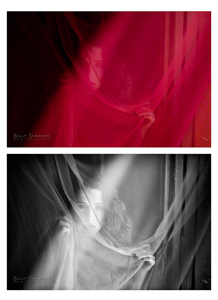
Here’s another comparison of a color and B&W processed photograph of Keira. She is stunning in both instances, but I definitely prefer the B&W image in this case. It’s more subtle. In the color version the skin color is very prominent. There’s nothing wrong with that and it is still a very artistic image. Lovely and compelling.
The B&W version however, is definitely more about the shapes and movement. It takes the viewer a split second longer to figure out what the subject is without the skin tone instantly giving it away.
Now, that’s certainly an extreme example, but it illustrates what I feel when I’m deciding to go with color or B&W.
Even in my travel photography, I find that B&W does tend to take the sense of time out of the image. Was it taken last year or 60 years ago?
I also think B&W has a better chance of engaging the viewer’s mind. The viewer already has to consider the image without color, filling in the information that is missing and maybe that also puts them in the headspace of imagination a little more than a color image. Maybe they create a story about the subject matter in their head. A story that is unique to them and their own experience.
Oh hell, maybe they just think she’s pretty. I don’t know.
Much more to come!
*Chimping: After taking a photograph with a digital camera, the process of looking at that image in your camera’s digital display. Chimping after every single photograph is regarded negatively by some photographers, especially those who learned to shoot on film cameras and didn’t have the luxury of instantly seeing what an image was going to look like unless they were shooting a test polaroid. They had to know their craft well enough to know if the photograph was properly exposed and what it was going to look like before it came back from the lab.
Chimping can also disrupt the flow of a photo shoot as it can take both photographer and subject out of the creative moment during frequent stops to play back images. I have to remind myself of that on occasion. Make a test exposure and check it once. That’s your polaroid. Then focus exclusively on your subject.
This is part fifteen in a series of blogs on my recent artistic adventures in Mexico.
Keira Grant pays attention.
There were so many highlights from this year’s ZoeFest in Todos Santos, Mexico. For a first timer like me, getting invited to this exclusive artists retreat meant I had a lot of catching up to do.
One of the brilliant ideas, aside from the incredible photo shoots, was that photographers Zoe Wiseman and Michael Marlborough had planned a series of open air slide shows on several evenings at Casa Dracula where everyone was invited to submit a five-minute presentation of their work, both photographers and models. It was a great way for me, someone never good with names, to get a crash course in who was who.
Plus, seeing all the tremendous work was really a treat.
Days later, when talking with Keira about our upcoming shoot on day five of ZoeFest, she reminded me of a style of photography that I used to experiment with quite a bit, but for no reason in particular, had put away a few years ago. She had seen one of those images in my slide show and suggested we should revisit it.
Very impressive, her recalling a single image of mine during an evening where cerveza, tequila and vodka were in great supply. Here was another model that was doing as much creative thinking about our shoot as I was. Whatever the opposite of phoning-it-in is. I really was getting spoiled with the caliber of models at ZoeFest.
I picked up Keira early the morning of our shoot and we headed off to Casa Dracula. I had photographed Samantha there at the beginning of the week in afternoon light, so I was curious to see what morning light looked like there. It was gorgeous.
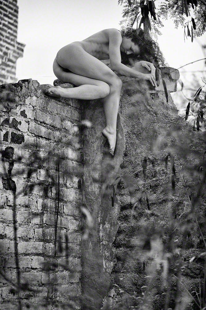
While Keira got ready, I climbed over a decaying wall that I had been eyeballing all week to see what was on the other side. Ruins of some kind. I had learned that Casa Dracula was home to one of the town’s sugarcane barons 150 years ago and it looked like not much had been touched since then. A good place to start.
We started with Keira in a very small roofless building. Well, building is probably more grandiose than it really was. It was really just a room of some kind with tall weeds growing inside. I stood a bit outside and used the open doorway as a framing device as Keira found a patch of good light. Good models always find the good light.
We shot for a bit there and then turned our attention to a corner of the decomposing wall.
“That looks pretty crumbly,” I said, as Keira was already half way up. “Careful.”
Another thing to mention is that it’s very easy for a photographer to spot an interesting shooting location before realizing someone is going to be crawling, climbing or laying on it with no clothing to protect them from any number of sharp edges or other skin damaging hazards.
“That looks like might hurt,” I grimaced, as Keira neared the top and began to find a way to balance for her first pose.
“No, it’s okay. I’m distributing my weight.”
And there she was. Perfect. All I could do was to make sure I composed quickly as she shifted through a series of poses I knew I would have been in a great deal of pain trying myself. But she was lovely and made it all look effortless.
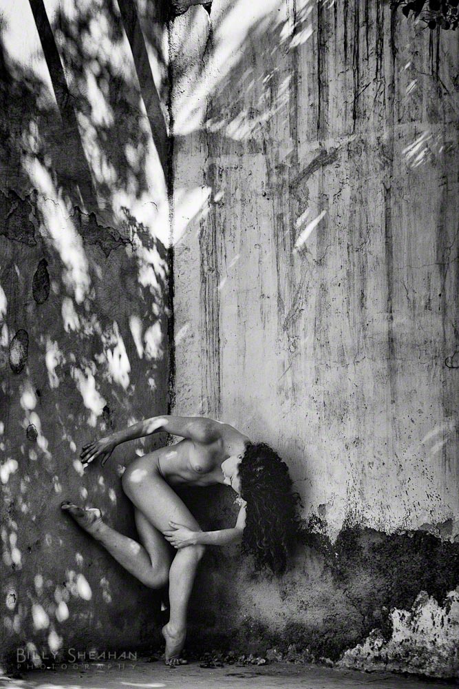
We moved on, with Keira swinging from a tree branch against a beautifully chipped wall. Her fun and enthusiastic energy was really making for a wonderfully creative morning and we had barely started.
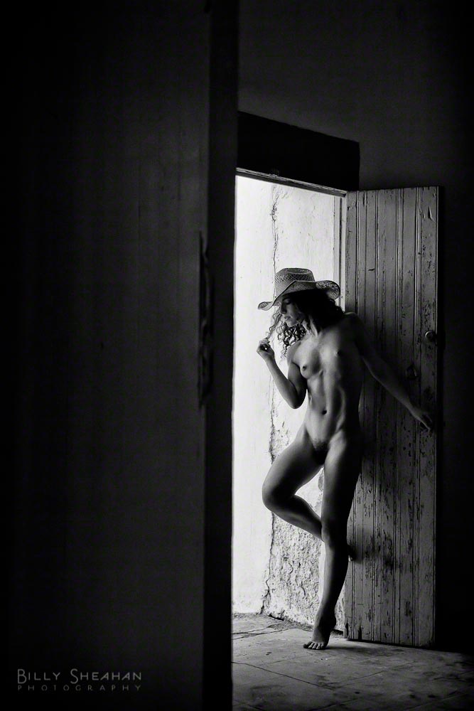
We headed back over the crumbly wall and inside the house, stopping for a moment at one of the many doorways that made the ground floor as much outside as in. Rather than working too close to Keira, I decided to use a longer lens and step back into another room, again shooting through one doorway toward the doorway Keira was standing in. I like working with negative space. I knew there would be a lot of darkness in the frame, but I was in the mood to compose something that was just the opposite of what we had been previously been doing in the bright daylight.
At one point Keira grabbed an old cowboy hat from nearby (there were always an odd selection of things nearby to grab as a bit of an accent at Casa Dracula), and before I could wonder aloud whether the hat might be a bit cheesy, she somehow made it anything but. In an instant, she was emoting another kind of character. Where there was strength and beauty before, now there was strength and a simmering coolness. Wonderful.
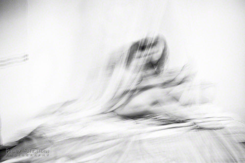
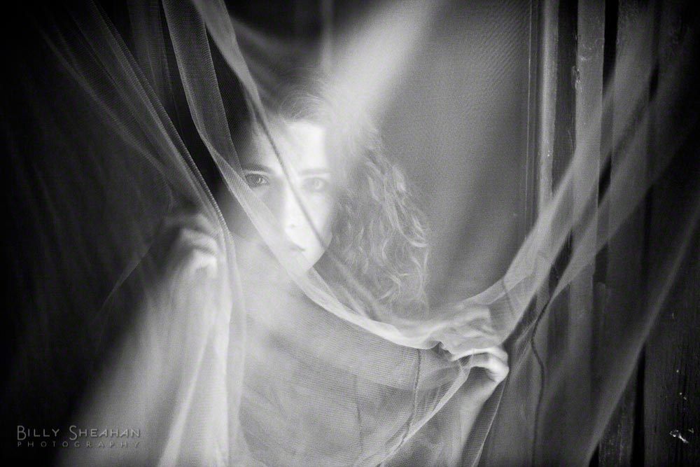
We headed upstairs to explore the rooms there and decided to start in the white room. Stark and almost devoid of anything except a bed with a large mosquito net hanging over it.
If you’re asking yourself, Hey Billy, you were going on and on at the top talking about how Keira had paid attention to something. When are we going to get to that?
Well, it was here in the white room that Keira reminded me again how she had liked one of my images where I was using long exposures to create wisps and blurs. It was true. When I was shooting in Paris a few years earlier I created a series of images with long exposures that created a very minimalist and soft white impressionistic photographs. Lots of negative white space that created almost brush-like strokes of a model I was traveling with at the time.
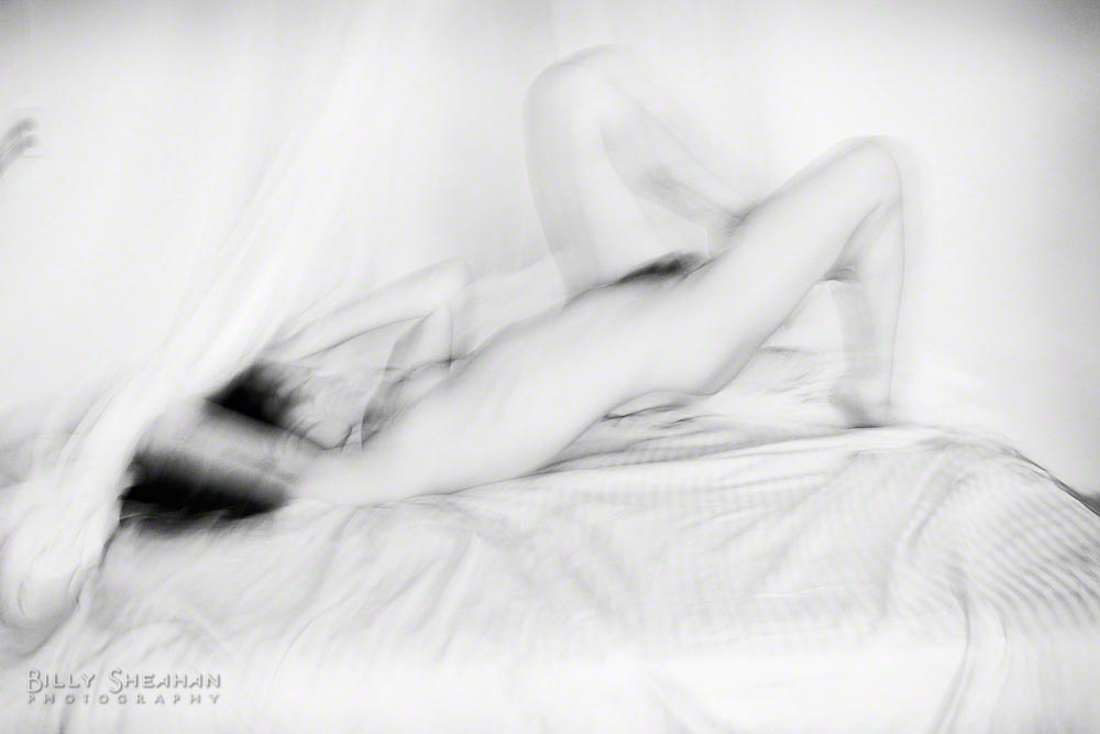
The light was different in the room we were working in now than the apartment I was living in back in Paris, but I thought it might be interesting to see what we could come up with here. And much like my Paris shoot, there was a lot of finding the rhythm of Keira’s movement and my camera movement to create those brush strokes again. Eventually we began to find the groove.
I was happy that I wasn’t copying exactly what I did before. These would be different. Not as pure white as my previous series, but with very pleasing tones all the same.
We decided to move to another room and continue, when Keira spotted a red mosquito net near one of the arched doorways leading to a small balcony on the front of the house.
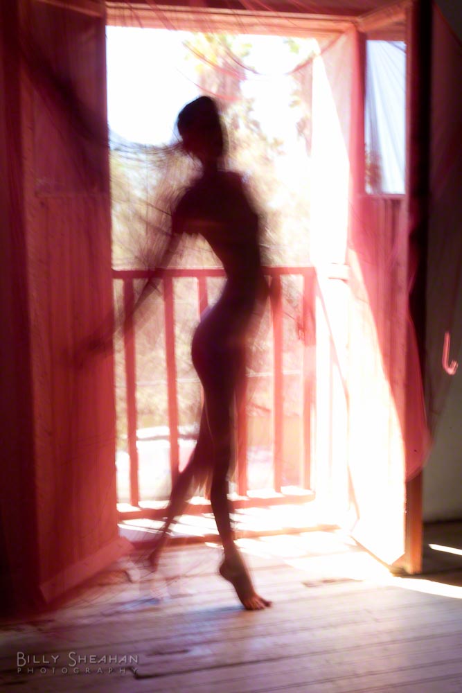
I was still taking light readings when I looked up to see that Keira had draped the netting over the doorway creating a red filter of sorts that moved with the breeze passing through. Excellent. Another instance of my model getting me halfway there before I had a chance to put my eye to the viewfinder.
And these would be color photographs. It was just too amazing, although of course I knew I would later play with B&W conversions just to see. I can’t help myself. But as I was composing, I was thinking, color all the way. Compose for the red.
I moved to the back of the room, opposite the doorway as Keira moved and danced while I moved and danced with my camera. We were completely in sync by now. Beautiful wisps of movement, parts of her form disappearing in the strong backlighting as she moved through the long exposures.
After a bit of it, I moved just to the side of the doorway and continued to shoot as she moved, this time with the light reflecting off of the netting as Keira twisted and turned and used the breeze to let the random movement of netting between us make her appear and disappear in my frame as the long exposures softened the movement in another wonderful way. Really stunning.
We finished off in yet another room, with Keira on a bed near an open window. But by that time, I knew we already had some incredible images. If we got anything here, it would just be gravy.
Keira was amazing to work with. She’s one of those models that can hang with the boys until you forget she’s a woman and then when she gets in front of your camera, she reminds you in short order that she indeed, is.
And of course, she pays attention.
More to come.